3 August 2023
I have been prototyping and exploring SwiftUI a lot over the past year. Over the last few months, I posted these prototypes on Twitter. As of today, August 3, 2023, I have my doubts about the future of the platform. For that reason, I'd like to share videos of my prototypes. As a bonus, I'll share code snippets and provide more details behind the interactions.
A bit of context about my journey: I've been coding for as long as I've been designing. I studied visual communication design in a professional arts school in Porto, where the entire school IT system was a Linux distribution that allowed you to log into your account from any computer. Each student had a free online hosting folder, and everyone took IT classes that taught HTML and CSS coding, as well as publishing that code online. As part of the visual communication class, I also studied Flash. So, my roots in design and coding are deeply connected to those technologies since high school.
At present, as an industry professional, I focus on product design, and I apply coding to my prototypes, hobbies, side-projects, and more. I have considered switching primarily to software development, and I've freelanced as a software engineer a dozen times.
My current focus is on SwiftUI, and I'm learning through the 100 Days of SwiftUI free online course by Paul Hudson. I can't recommend it enough. Thank you, Paul, for the amazing material. My experience with iOS so far has been launching a simple currency converter app in 2016 written in Swift. In the future, I hope to delve into visionOS.
Component Reference Catalog
I built the simplest navigation for different types of components readily available in SwiftUI. Code available on GitHub.

Path Drawings Prototype
Following Paul’s lesson, I made a prototype with path drawings.


AirDrop Arrow Recreation Prototype
A prototype of the motion similar to the AirDrop arrow that rotates with the device.

Checkmark Animation Prototype
A simple path animation with haptic feedback that can be triggered at any moment.

An animation with the toolbar icons smoothly animating into the top of the keyboard. It's just a really small bit of polish work for the Notes app.
This is actually not a SwiftUI prototype, just a Figma prototype. Nonetheless, I want to include it on this list. I hope to follow up one day with the real implementation.

I love learning SwiftUI and creating these prototypes. While they don't push the boundaries in the field of human interface design, I hope to one day prototype things that are truly innovative. For now, I'll remain focused on learning the craft.
Thank you for reading.
22 June 2022
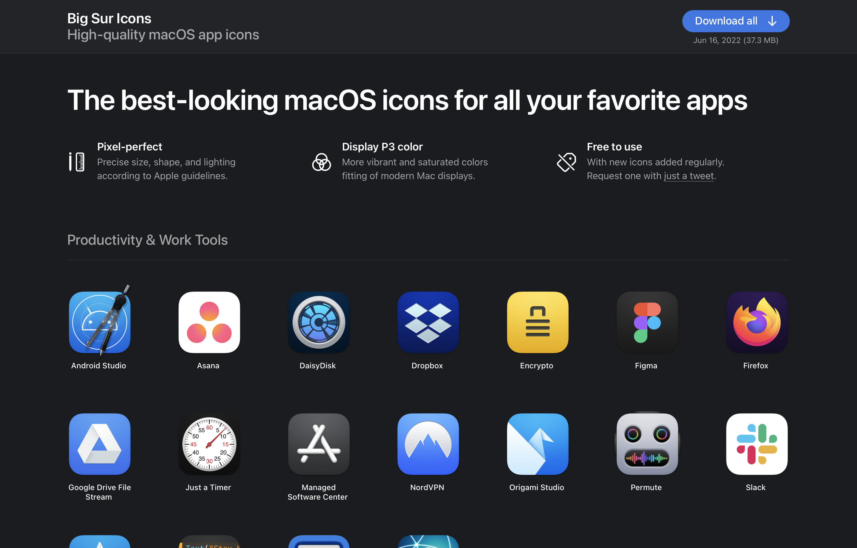
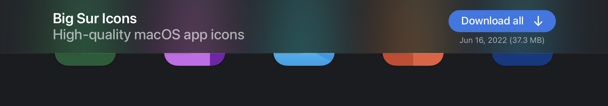
I've launched a redesign of the Big Sur Icons website. Here's a look at some of the work that went into that work and the motivation behind it.
 New design of bigsuricons.com
Big Sur Icons is a side project I started after the launch of macOS Big Sur to redesign some third-party app icons to follow the new style introduced in that release. I used it also as a way for me to learn how to use Pixelmator Pro and improve my skills in app design as a whole.
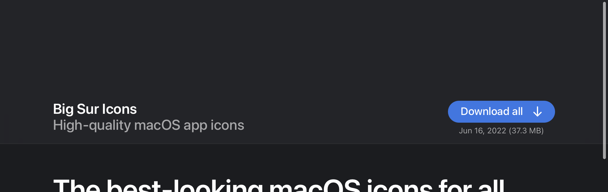
Now that the project is 1.5 years old, I looked back at the website I made for it and put some time into adding some improvements.
Here's the original design:
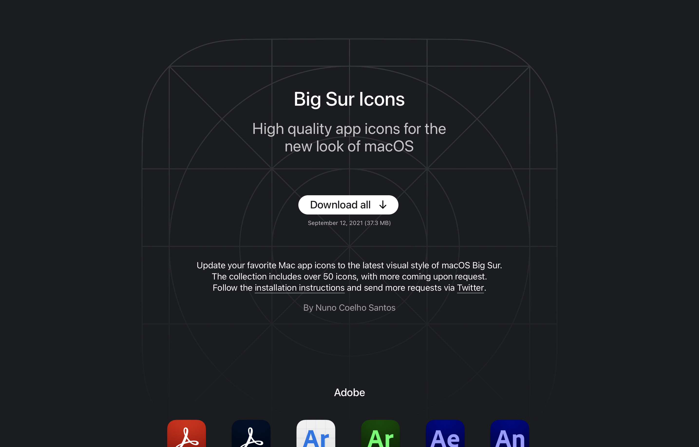 Original design of bigsuricons.com, January 2021
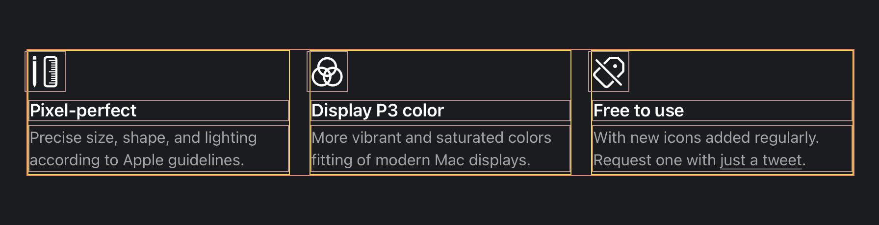
I had three key aspects I wanted to focus on:
- Larger app icons, and more spaced out. So that people can more easily see the detail in the visual design.
- State why this collection might be better than other options on the internet. Specifically calling out the craft and the use of Display P3 wide color gamut.
- Clearer download actions. It might have not been very intuitive that users can download individual icons with the previous design. And the "Download all" button perhaps didn't stand out enough.
Top Section
The top section is now shorter, but bolder. I removed the lengthy paragraph in favor of a more compact fixed bar at the top and 3 key selling points in a grid.
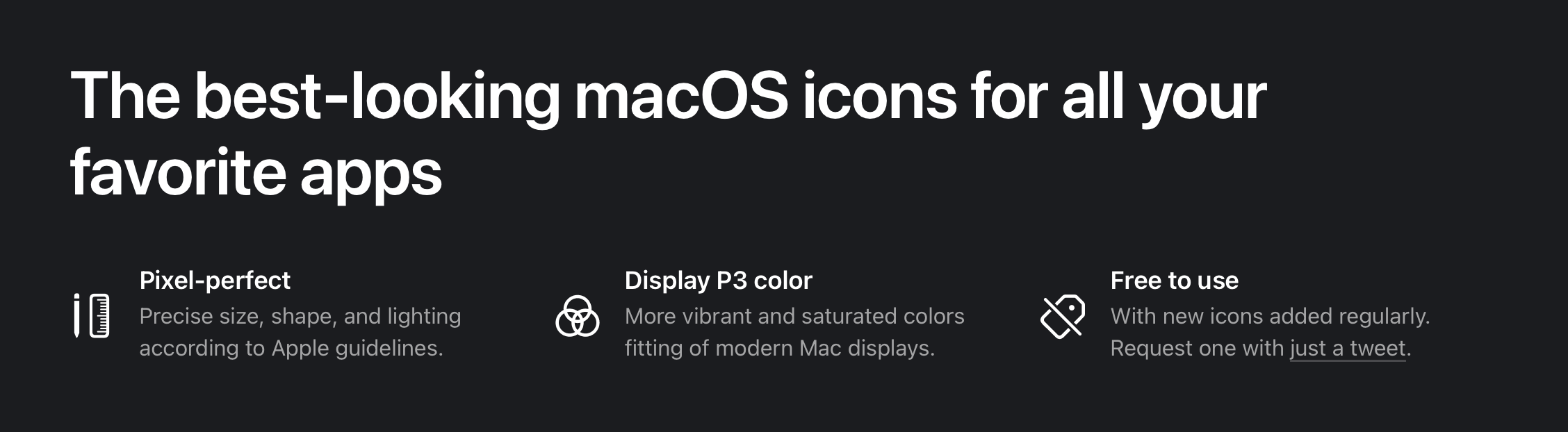 New top section
On smaller screens, a lot of the detail is gone to make space for the icons. The download button is also reduced to just an icon.
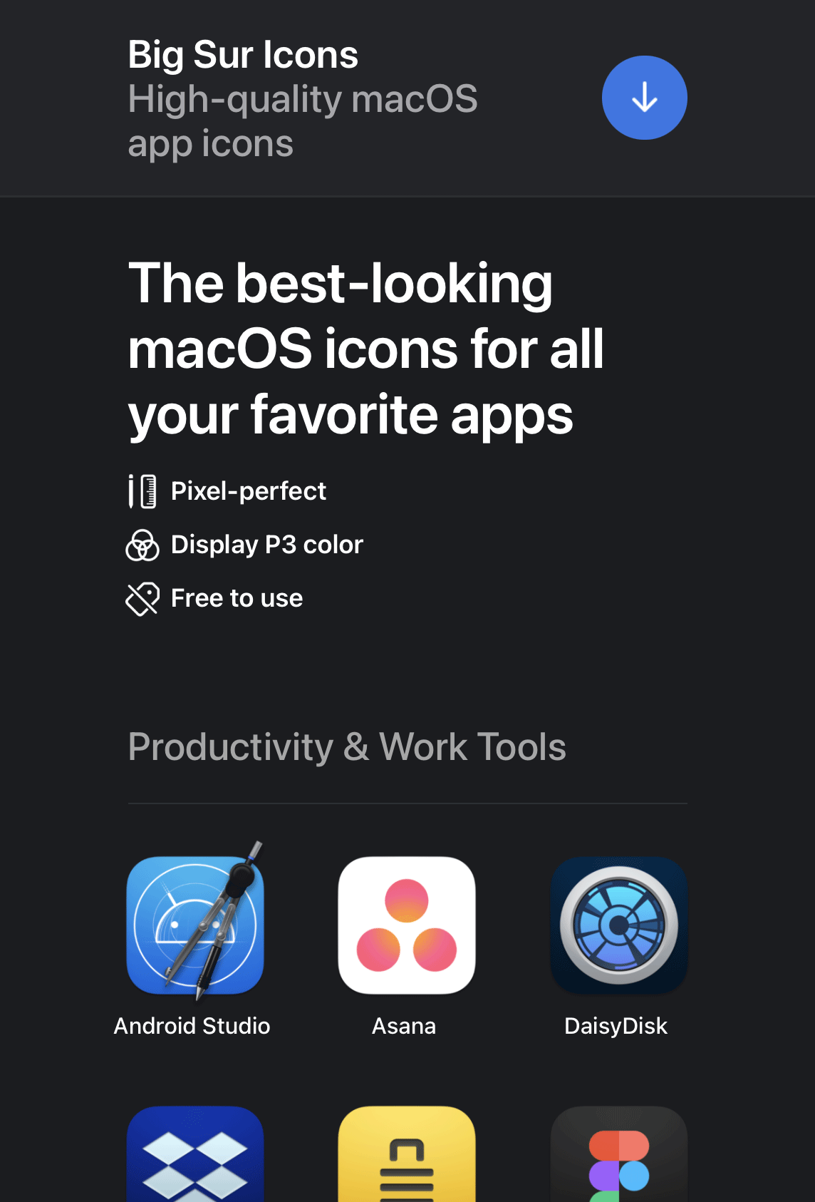 375 point width viewport
Clearer Actions
Another key aspect that I wanted to improve was the prominence of the download actions. First of all, the buttons are now blue to stand out from the dark theme. And when hovering on any icon a download button appears, covering the app name.
 New hover state
Thin Material Background
In the pursuit of adopting Apple's design language, I've decided to use a material treatment for the header. This gives the user a sense of dimensionality to the overlapping UI components. I've used the CSS backdrop-filter property to achieve this effect.
 Thin material on the header background
Code snippet for creating the thin material effect:
header {
  // Body background color with transparency.
  background-color: rgba(27, 28, 31, 0.72);

  // Increase brightness, saturation, and add blur.
  backdrop-filter: brightness(200%) saturate(150%) blur(42px);
}
To keep the material appearing when the user overscolls on the top of the view, I've added an element to fake the effect of the material continuing beyond the bonds of the scrollable area. I could have also made it so that the header is constantly fixed even on overscroll, but this felt more natural.
 Extending the material beyond the scrollable area
Code snippet for adding a background to the top overscroll area:
html:after {
  // Create a fixed pseudo element that fills the width of the viewport.
  content: '';
  position: fixed;
  right: 0;
  left: 0;
  height: 300px;

  // Move the element out of view.
  // I found it necessary to have one pixel in view for the pseudo-element to render.
  top: -299px;

  // This is an eyedropped color of the thin material overlaying the body background color.
  background-color: #232428;
}
Flexbox
I don't regularly develop for the web, so I'm new to the CSS flexbox attribute. I'm pleased to say that it was incredibly easy to implement and worked very well for this purpose. I like that text is baseline aligned between columns.
 Flexbox with outlines
Code snippet for this 3-column layout:
ul {
  align-items: stretch;
  display: flex;
  flex-direction: row;
  flex-wrap: wrap;
  gap: 20px;
  list-style: none;
  li {
    flex-basis: 0;
    flex-grow: 1;
    flex-shrink: 1;
  }
}
Details & Summary
Other new standards I used were the HTML details and summary elements. I used them to collapse the installation instructions so that they only appear after the user clicks or taps on the title. This behavior works out of the box.
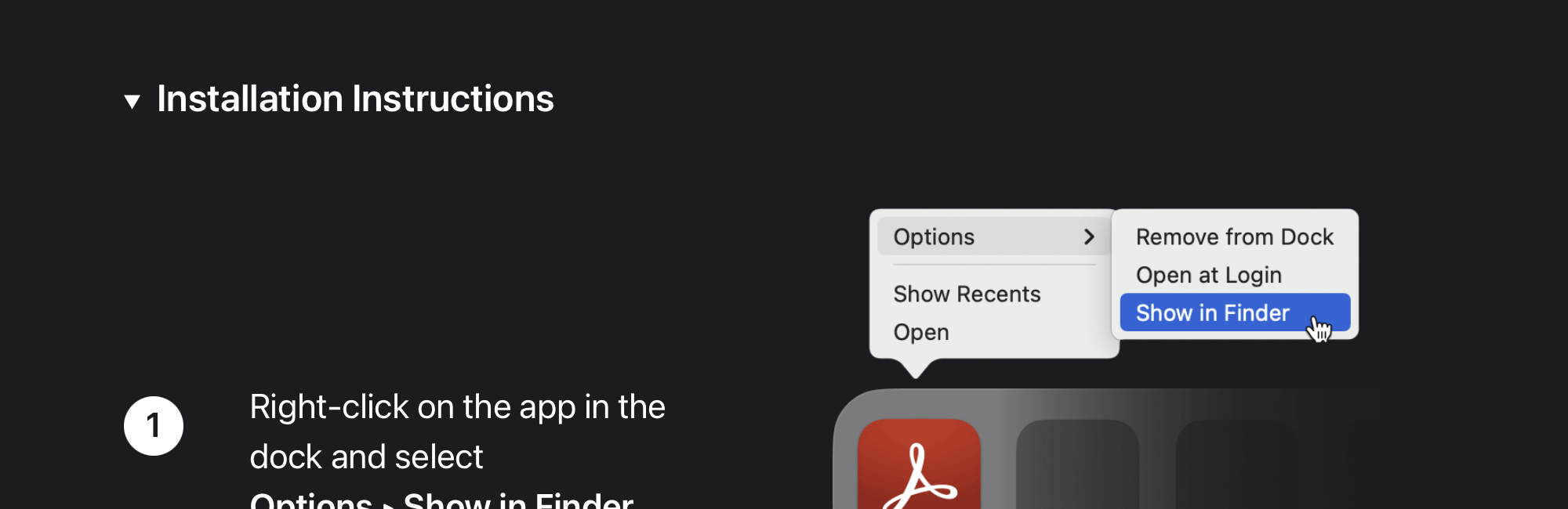 The "Installation Instructions" section uses the Details & Summary HTML elements
Code snippet for the details & summary structure.
<details>
  <summary>
    // Content always visibile goes here.
  </summary>
  // Content visible only when expanded goes here.
</details>
A final detail worth adding is that I included a Twitter URL scheme that automatically pre-populates the text when creating a tweet.
Code snippet for the pre-populated tweet:
<a href="https://twitter.com/intent/tweet?text=@nunosans My Big Sur icon request:">Tweet</a>.
On the web, this would open twitter.com with the compose window prepopulated:
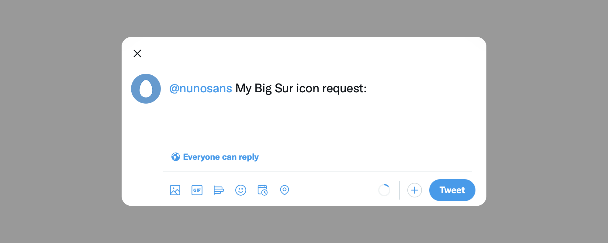 Pre-populated tweet
This is all I have to share. I hope you like this update. And if you like the project, please share it!
16 June 2022
I've made a new icon for Android Studio to add to my collection of redesigned icons for macOS.
Download it here.
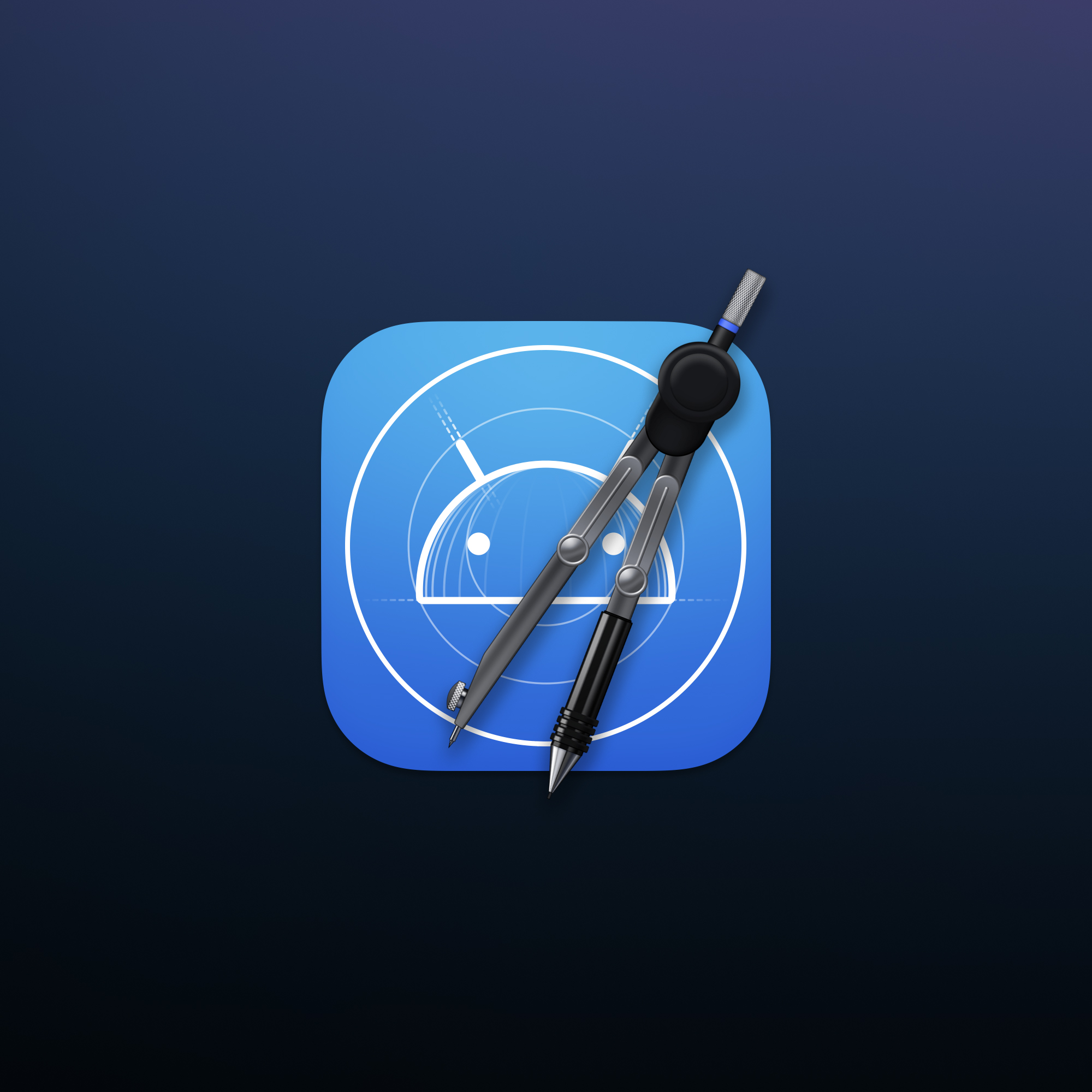
The inspiration clearly comes from Xcode's own app icon with the blueprint background, and the existing icon for Android studio that depicts the droidbug and a compass.
For the design of the compass I used a reference photo of a Rotring compass and recreated it in Photoshop. The proportions were adjusted to make the legs shorter and chunkier, making them fit better as an app icon. For the top hande I've resorted to using a texture of bare metal and distorting it to look tri-dimensional.
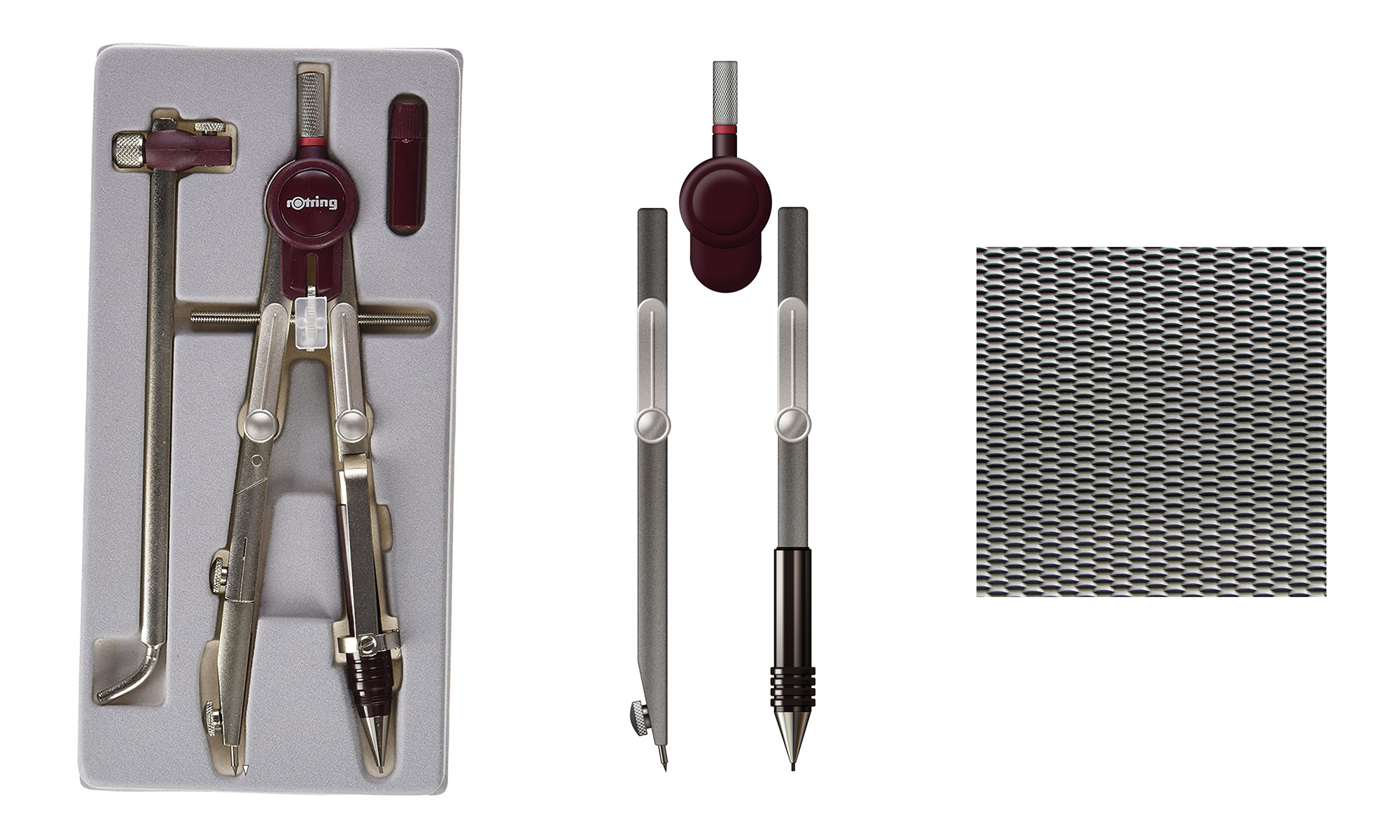 Rotring compass photo next to a digital recreation in Photoshop
 Droidbug created in a blueprint sketch style
I hope you like it and let me know if you set it up on your Mac!
Check out the full collection on bigsuricons.com.
15 February 2022
A list of mentoring platforms for designers of all levels.
Free
Paid
12 March 2020
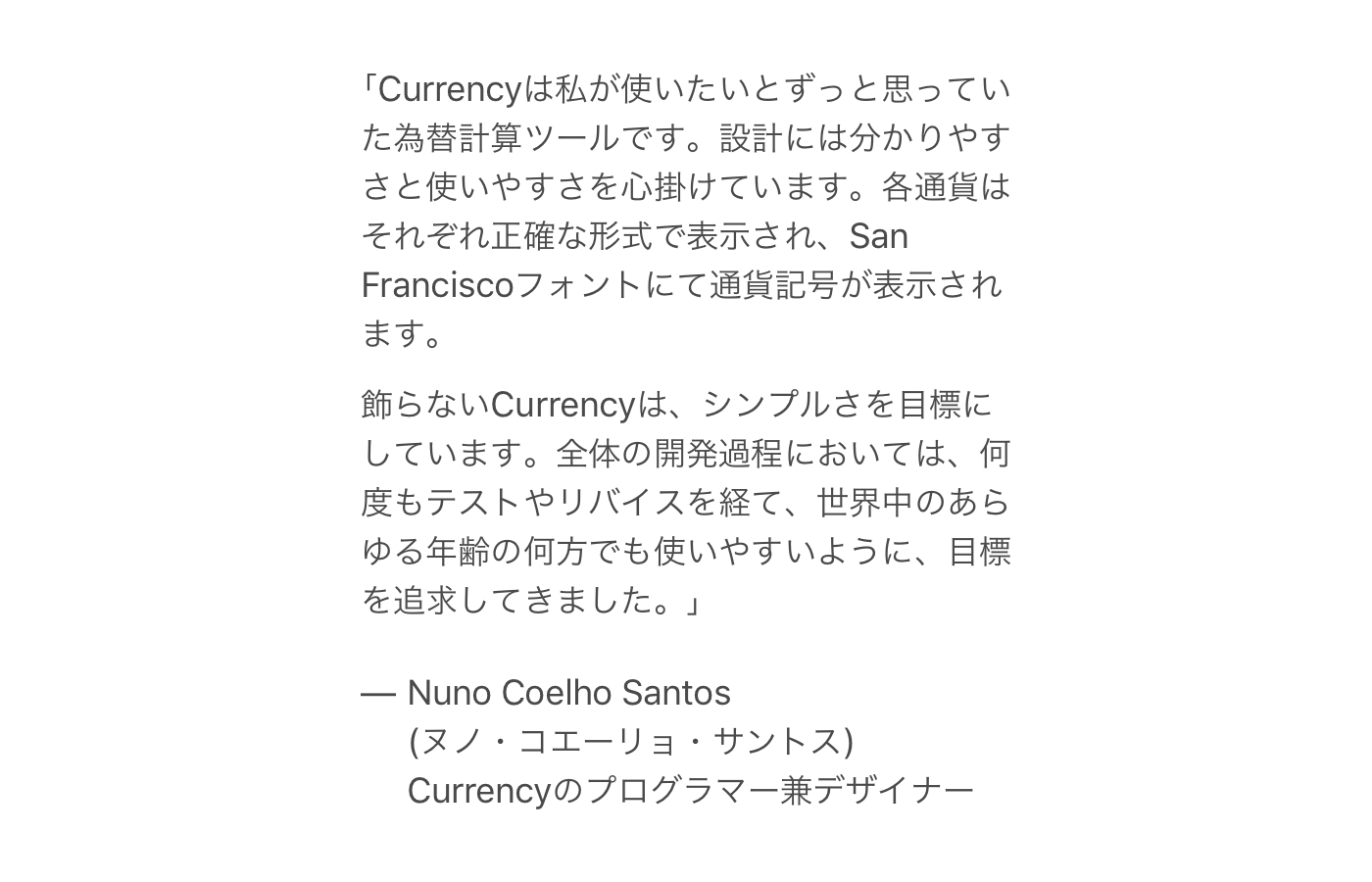
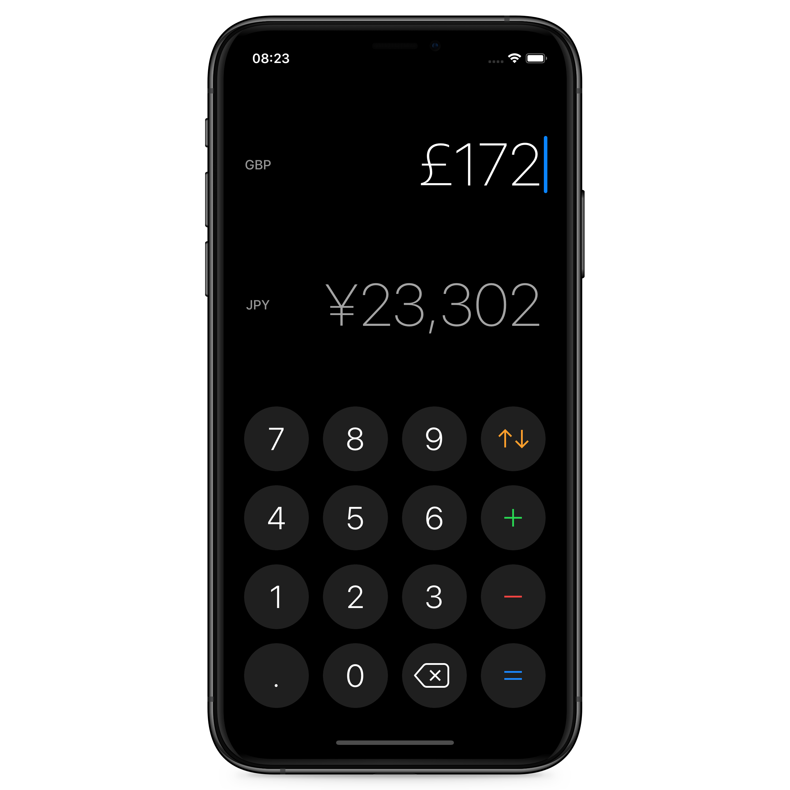
Back in 2016 I released my first iOS app Currency, a simple currency converter app for iOS. It was designed for anyone who needs to convert a foreign currency to their native currency while traveling. I launched it while living in Tokyo and I’ve written about its design on my portfolio.
One of the more interesting challenges in designing Currency was localizing it. This article delves into the workflow and design details that go into localizing an iOS application, its website and marketing material.
But first, why localize?
A product that doesn’t speak your language is most of the time a product you end up avoiding. My assumption, was that localizing Currency would generate a lot of downloads in non-English speaking countries. To achieve this the app had to not only had to support the user’s language but also format currency in a locale sensitive way.
More on what that means and what impact it had later in this article.
Localization process
When you look at the main screen of Currency, you might ask yourself “What is there to localize?”
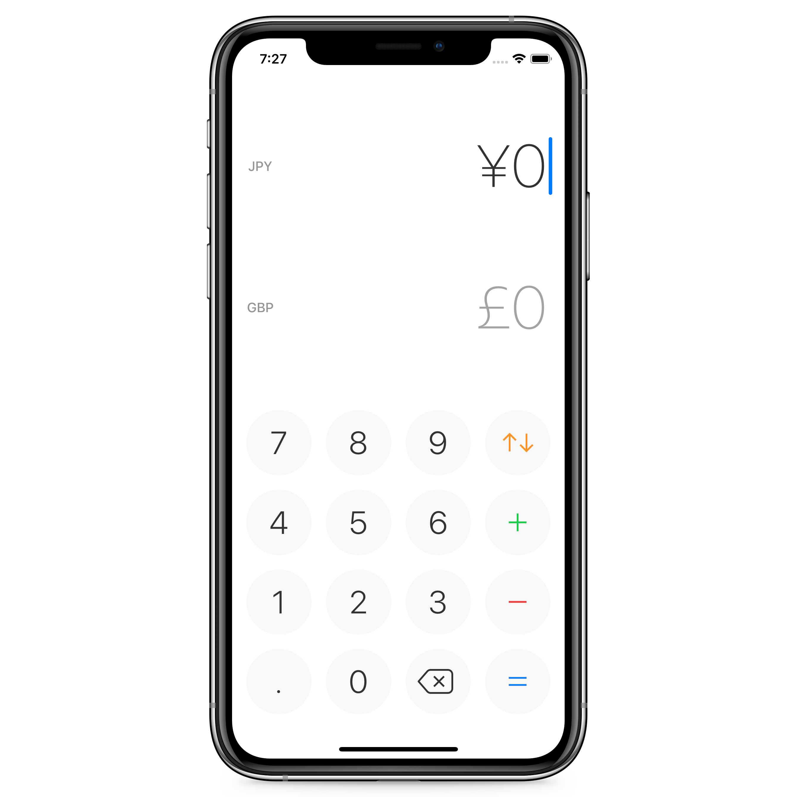 iPhone running Currency for iOS
However, looking at the screen to switch currency the story changes. You’ll notice that there is a name for each single currency that I want to localize, so other languages speakers can use the app effortlessly.
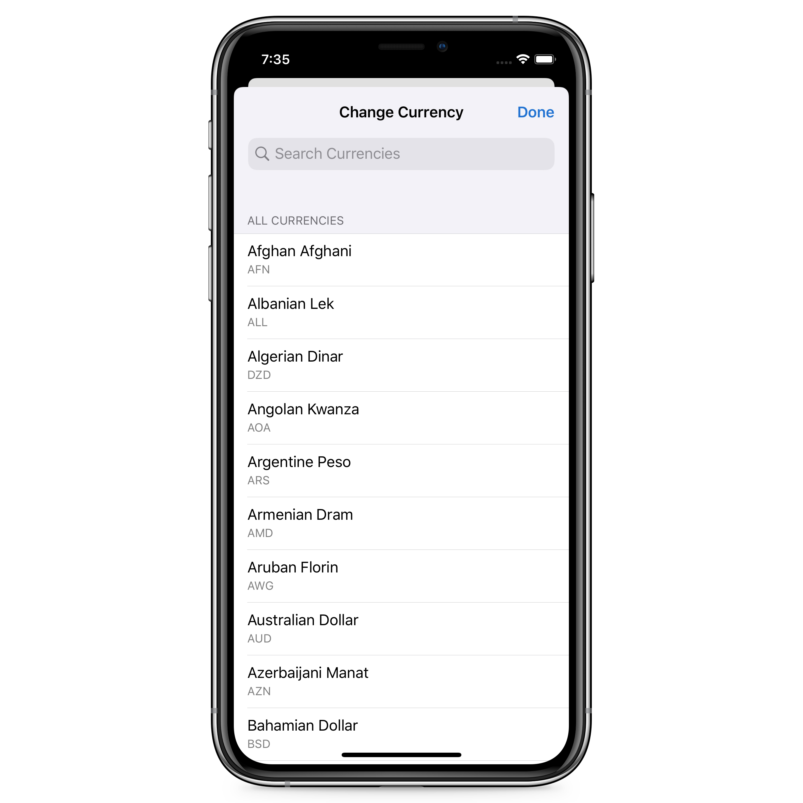 Currency’s view to select a currency
I opted for using currency codes as I found them to be the most correct way to identify a currency. Flags are also not ideal since I plan to add discontinued currencies, digital currencies, and perhaps even fictional currencies in the future. Another consideration was also that not all fiat currencies belong to a specific country, like the Euro.
To start localizing the app you create a file for each locale, use an identifier to each string and define what the text should be for that identifier in that specific locale. For example:
In the English file:
Title = "Localizing Currency"
And in the Japanese:
Title = "カレンシーのローカリゼーション"
Then on your app you just use the ID Title where the title is meant to go and the app will show ”Localizing Currency” on iPhones in English and ”カレンシーのローカリゼーション” on iPhones in Japanese.
Below you can see how one of those string files looks like on Xcode.
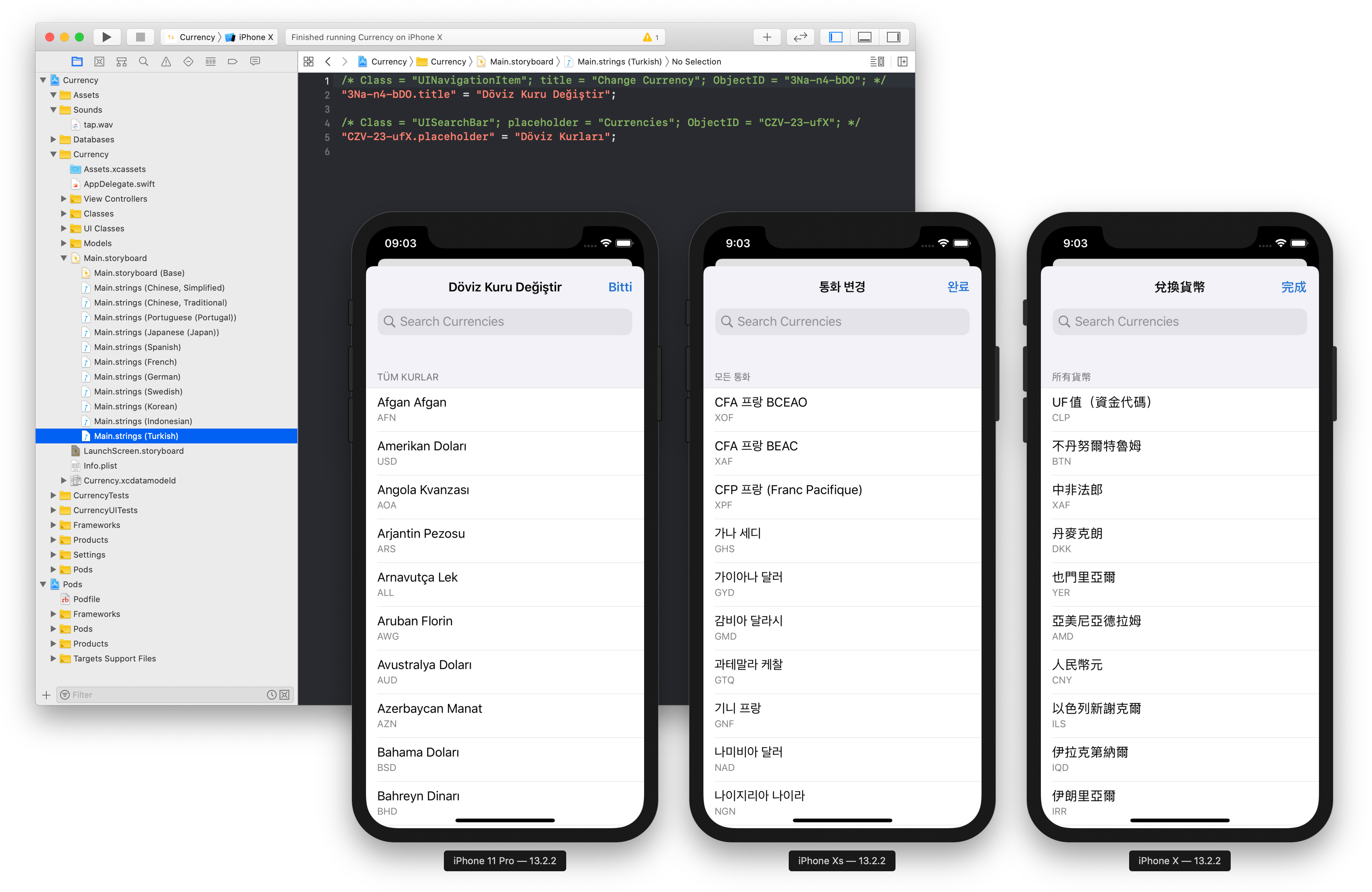 Screenshot of Xcode’s localizable strings and simulator running in Turkish, Korean and Chinese (Traditional)
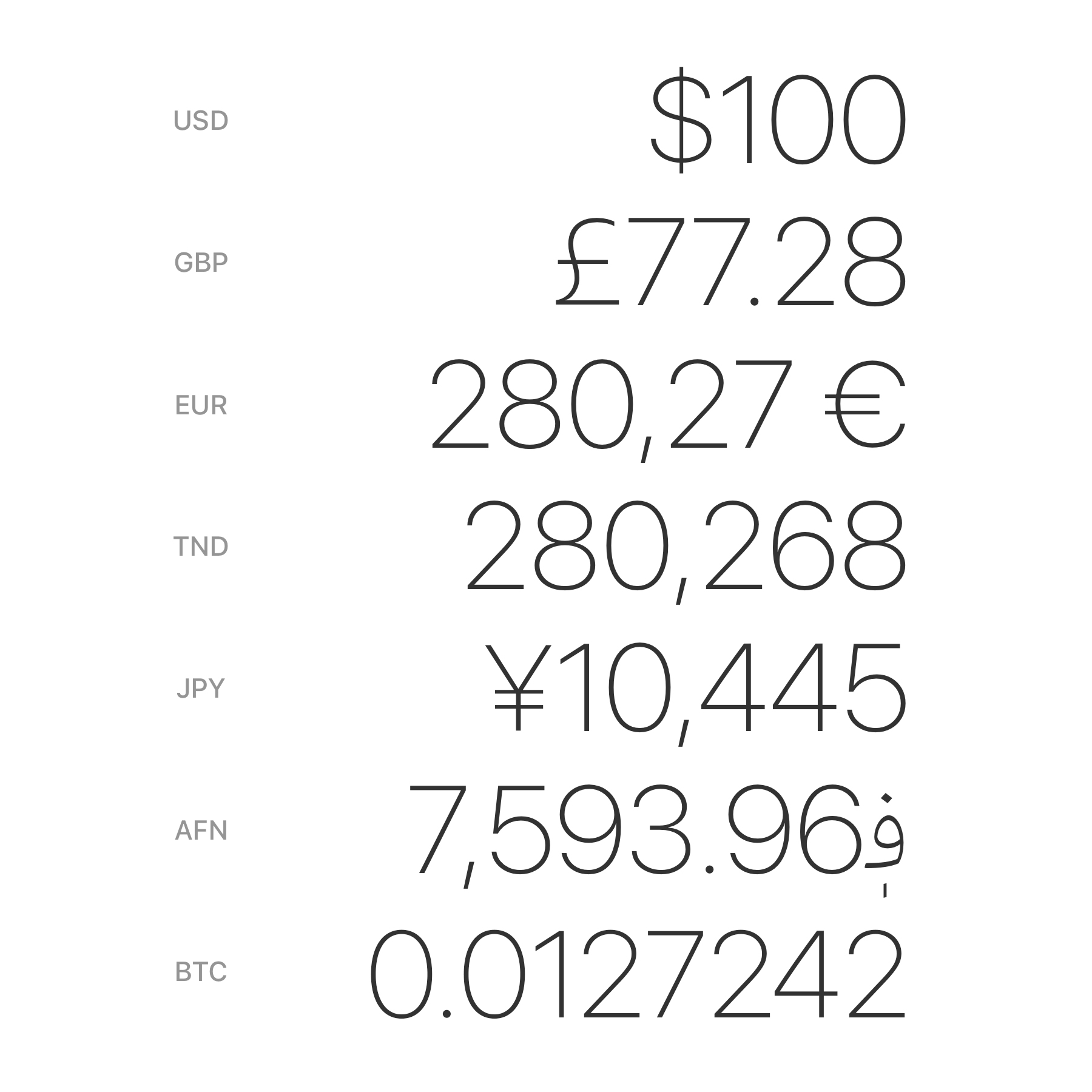
Currency currently supports 14 different locales: Chinese (Simplified), Chinese (Traditional), English (UK), English (US), French, German, Greek, Indonesian, Japanese, Korean, Portuguese (Portugal), Spanish (Spain), Swedish and Turkish.
With over 150 different currency names this adds up to over 2,000 strings to translate. To sort all this data, I put together a spreadsheet with this data and asked friends to review and input the correct names.
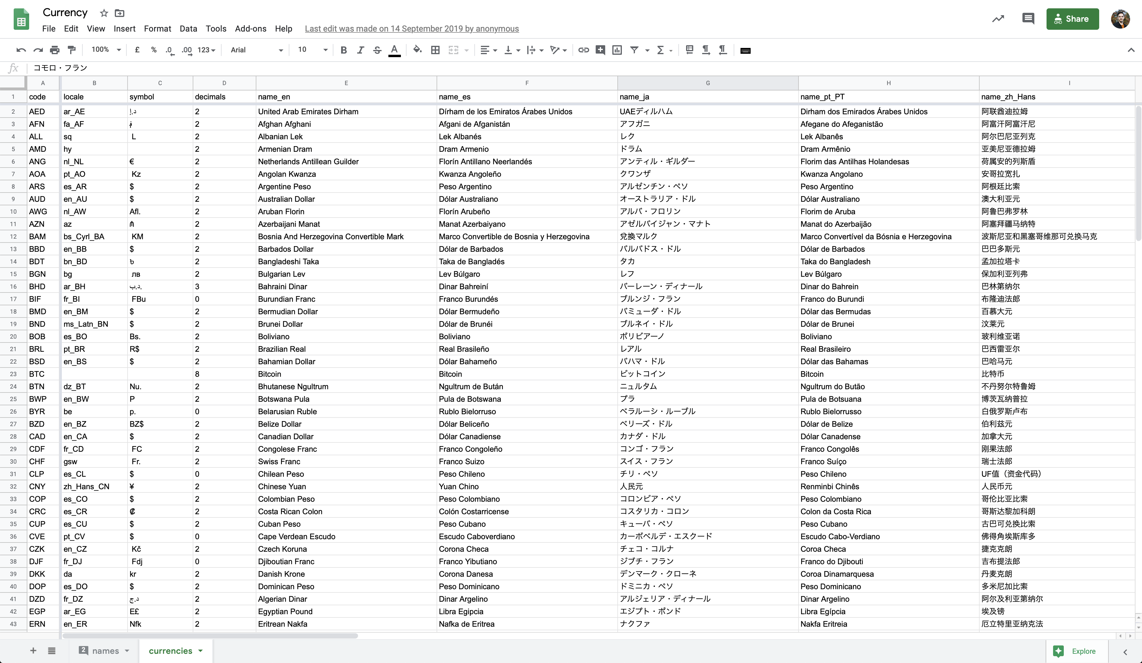 Screenshot of the Currency spreadsheet used as an initial database
This spreadsheet has the following columns: code, locale, symbol, decimals, name_en, name_es, name_ja, name_pt_PT, name_zh_Hans, name_zh_Hant, name_sv, name_de, name_fr, name_it, name_ko, name_da, name_pl, name_tr, name_th, name_el, name_id, rateFromUSD, symbolPosition, useLocalization, useCustomSymbol, useSymbol. Which means that each single currency name goes directly in the database.
Another important decision was how to format the numbers displayed. I could have formatted all numbers with a comma divider for every 3 digits and a dot for decimals, like 1,000.00. Still, once again, this isn’t how most numbers are formatted. Some regions use a comma to separate decimal places and commas to group digits, but others do it the other way around. Some have 3, 8 or no decimal places. Some have a symbol on the right while others keep the symbol on the left.
You can see in the spreadsheet above a locale column where I specify a locale for each currency, if applicable. Then the column useLocalization is where I define whether or not to use the iOS built-in formatter to format the number based on that locale.
The format of each currency isn’t defined based on the users locale but instead on each individual currency. I used iOS’s built-in libraries to format the most of the currencies correctly.
When not using the iOS built-in formatters, I make use of the other columns symbol, decimals and symbolPosition to format the currency correctly.
 Examples of how different currencies are formatted
Why is this important? Going back to the user I’m designing for—a traveler in a new country—I want them to see a number in the real world, enter it exactly the same way in the application, and see the conversion to a recognizable currency in a familiar format. This way they can be confident that the conversion is correct.
You can read this Quora post on why different countries format currencies differently: Why do some countries use a period and others use a comma to separate large numbers?[…]
App screenshots
Another important material to localize is your marketing material. You want your users to know from the get-go that this app speaks their language, and this means having to generate App Store screenshots for each individual locale.
The best approach here is to use Figma components so that all of the repeated artwork can stay in place, and you just replace the headline and screenshot as needed. Figma unfortunately doesn’t seem to have an easy way to render the same frame for different locales so there’s a lot of manual work involved on this step. If you have tips to speed this up, please get in touch!
 Image of different App Store screenshots in Figma for different languages
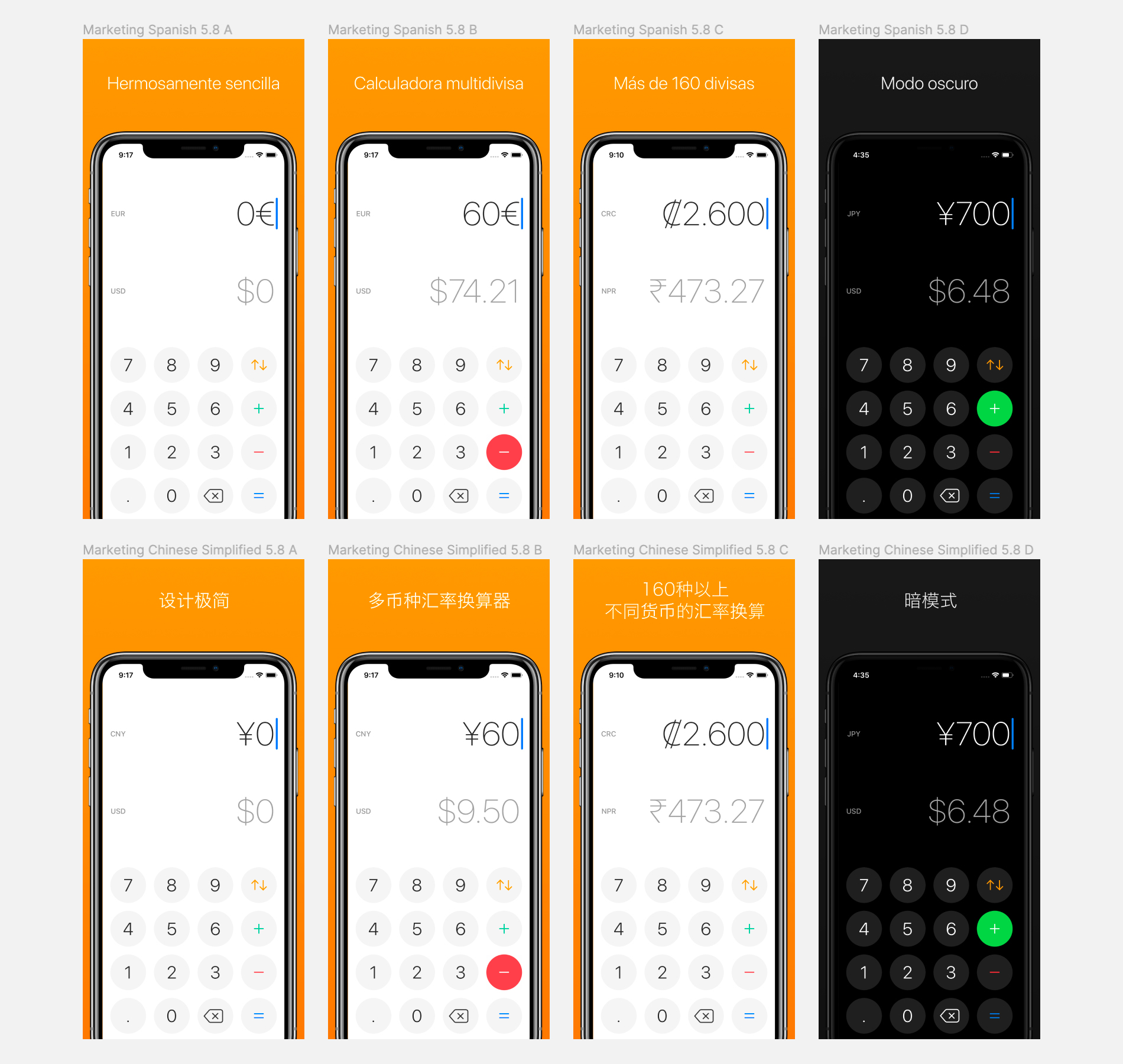 Close up image of different Spanish and Chinese screenshots in Figma
Notice on the close-up above how Spanish screenshots use Euro in the iPhone and the Chinese uses the Chinese Yuan.
Word breaks in Chinese, Korean and Japanese
Currency’s website was also translated into 6 languages: Chinese (Simplified), Chinese (Traditional), English (US), Spanish (Spain), Japanese, Portuguese (Portugal).
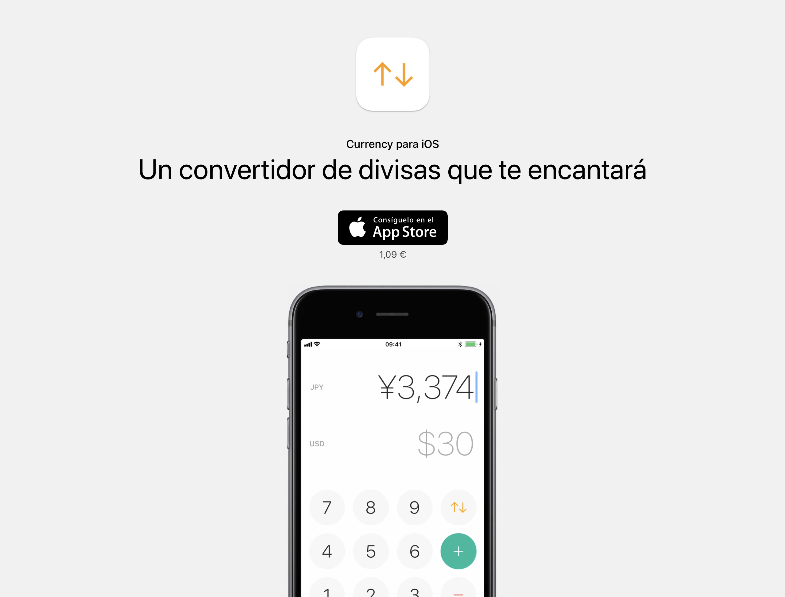 Currency website in Spanish
I built it using Middleman, a static site generator. Middleman has a localization module which is very simple to use. The gist of it is all the same: Create localizable string files, use the string IDs in the templates, and it builds pages for each locale.
Here’s how the first lines of the English localization file en.yml for the Currency website looks like:
  ---
  en:

    # Header
    title: "Currency for iOS"
    tagline: "An elegant currency converter you’ll love"
    app_store_badge_image_url: "app_store_badge_en.png"
    price: "$0.99 • £0.99"
And the Spanish file es.yml:
  ---
  es:

    # Header
    title: "Currency para iOS"
    tagline: "Un convertidor de divisas que te encantará"
    app_store_badge_image_url: "app_store_badge_es.png"
    price: "1,09 €"
Note how I pass an image file name for the App Store download badge, and that the English file has prices both in US dollars and British Pounds.
If you want to see all of the code for the website, have a look at the code repository on GitHub.
Chinese, Korean and Japanese languages don’t use spaces for word breaks, so it’s very common for websites in these languages to break lines in the middle of words. Browsers simply don’t know where a word begins and ends and therefore don’t know how to break lines correctly.
 Screenshot of Japanese text without wrapped words
A solution is to use a tool from Google called Budou. Budou takes a piece of text, processes it in a machine learning model to identify words in that piece of text and wraps the words in HTML tags.
With this, all of my Chinese, Korean and Japanese text can break correctly. The image below has each word highlighted in red. You can compare the result with the previous image.
 Screenshot of Japanese text with words wrapped (highlighted)
In terms of how the code looks like, Budou takes a piece of text like this:
$ budou あなたが恋をする為替計算アプリ
And outputs:
<span class="ww">あなたが</span><span class="ww">恋を</span><span class="ww">する</span><span class="ww">為替</span><span class="ww">計算</span><span class="ww">アプリ</span>
Which allows me to apply the correct styles in order to break lines correctly.
I had to outsource a lot of the work to my group of friends in order to get all of the different materials translated. To do this, I prepared a ZIP file for them to download.
The ZIP includes a set plain text file and Microsoft Word file with all the copy in the app. I also added screenshots as well to give context to the copy.
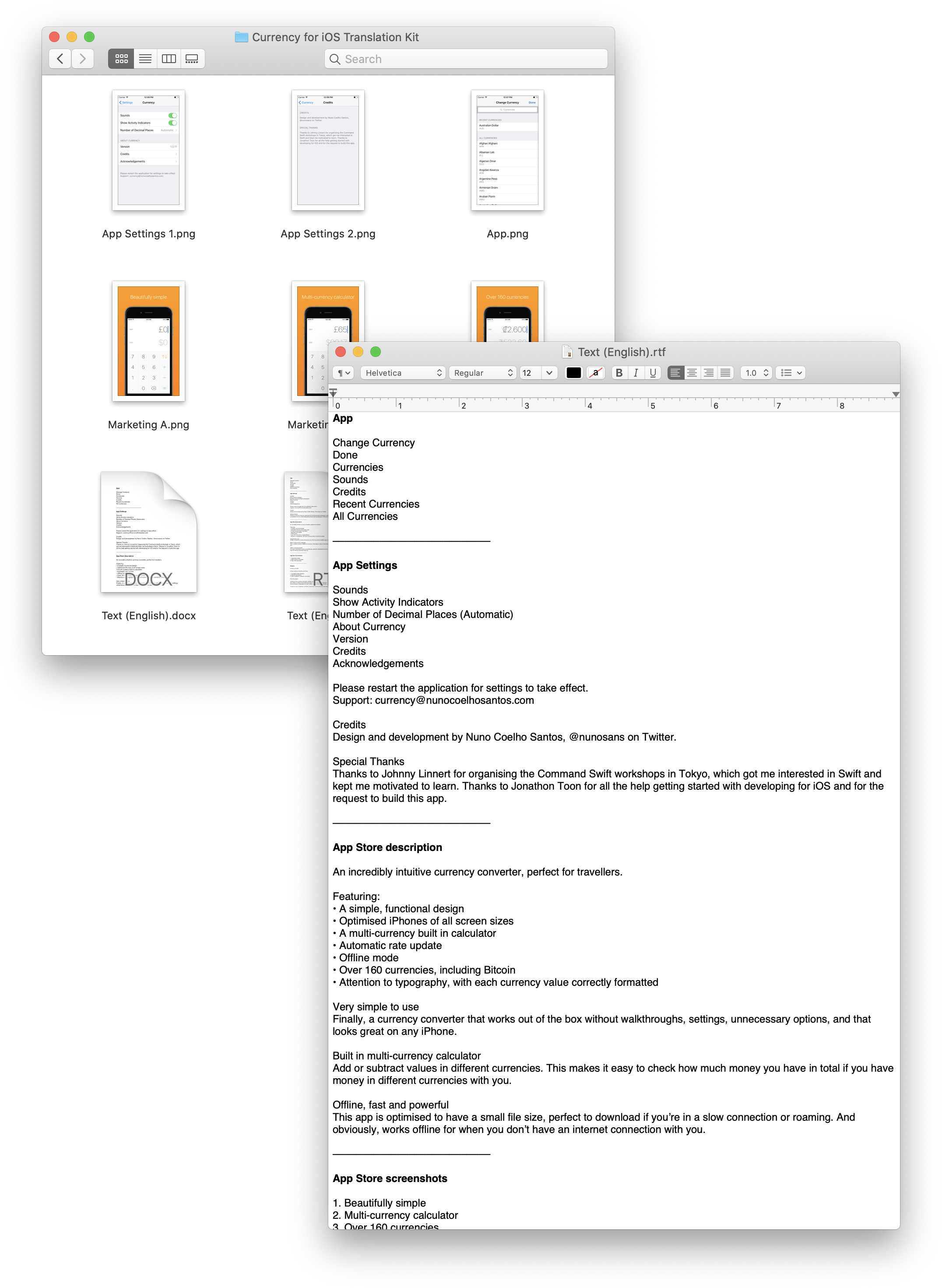 Screenshot of the translation kit folder and text file
The text files are: Basic for the app itself, names of currencies, copy for the website, copy for the app store description and copy for the app store screenshot titles.
Closing the source
I’ve had Currency open source for a very long time on GitHub and my main motivation for this was to help newcomers learn iOS development from my work. I really wish I could keep sharing the code base for the project so you can see it in action, but unfortunately I had to stop.
There were several clones of my product appearing on the App Store and after Yahoo! Finance closed it’s free API with currency exchange rates, I had to start serving the latest currencies from my own server and start charging for the app. It was at this point that I had to rewrite all of the networking and I also closed the source for the project.
You can still refer to the original version of the app on GitHub which doesn’t include the changes mentioned above.
Things I didn’t get to do
I wanted to implement a feature where the dot button would change to a comma based on the currency being inputted, or it would be hidden altogether if the currency doesn’t support fractions, like the Japanese Yen for example. Sadly, I didn’t have time to add this logic to the app just yet.
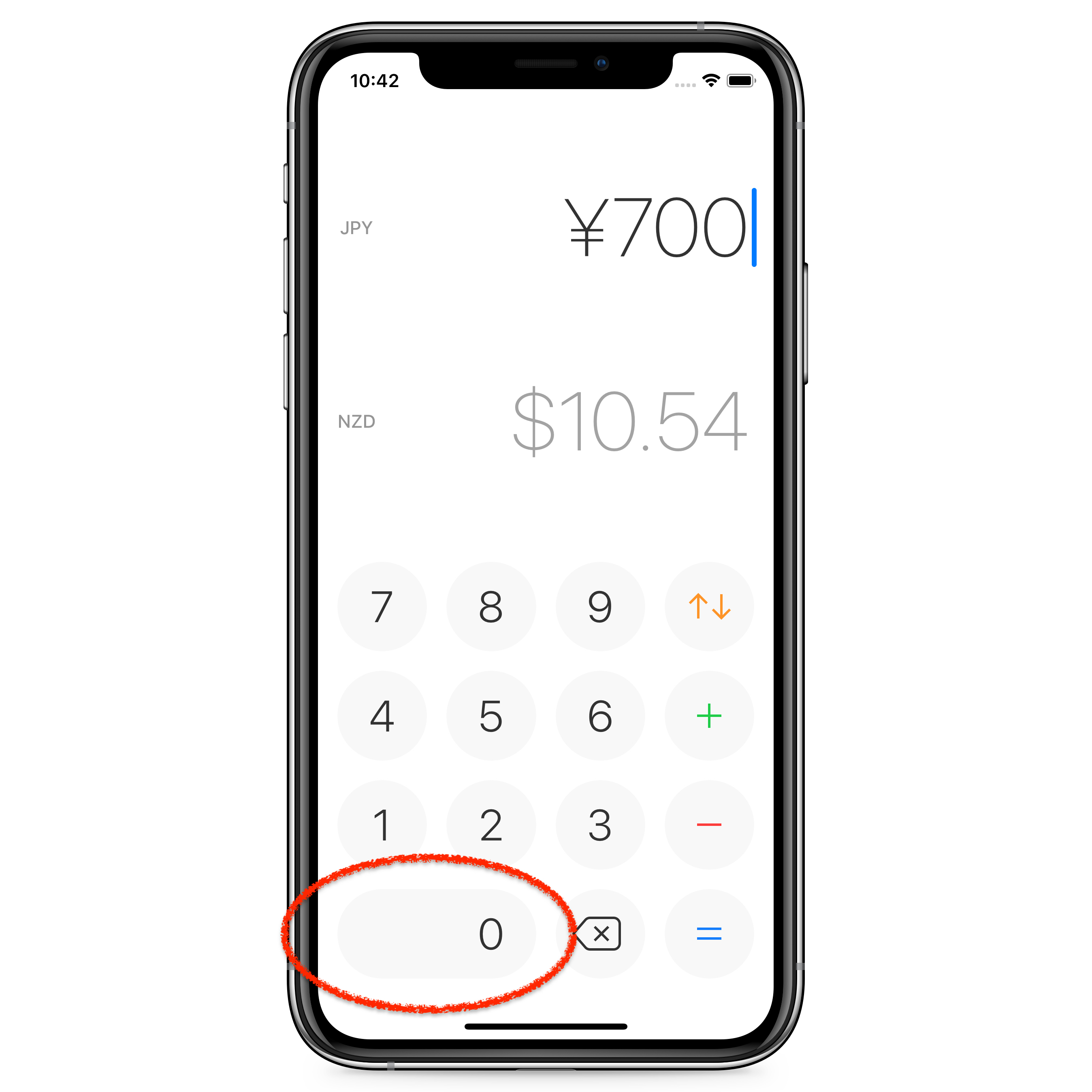 Mockup of Currency with no decimal place button
Impact
Until today, 85.26% percent of all downloads come from non-English speaking countries. This means non-English speaking territories provide 6 times the number of downloads compared to English speaking territories. 33.85% of all downloads come from Japan and 30.3% come from China and Taiwan.
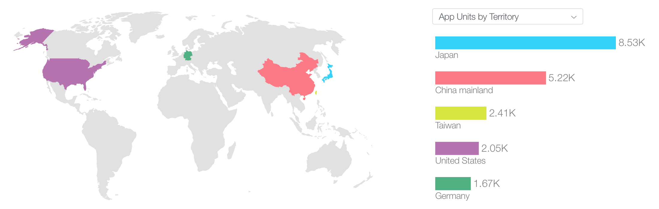 All-time downloads by territory
The extra effort in localizing not only made my product more friendly to my users, but also translated into downloads I would likely not get otherwise.
New version of Currency
 Currency for iOS using iOS 13’s dark mode
I want to wrap up by sharing that the latest version of Currency supports dark mode and is available to download for $0.99 on the App Store.
Thanks for reading this article, and I hope it was insightful. If you’d like to get in touch, find me on Twitter @nunosans or email currency@nunocoelhosantos.com.
Thank you Matt Vagni, Mitchell Petrie, Tiago Alves and Tiago Veiga for reviewing early drafts of this article.
21 June 2019
When you try to influence someone, you will achieve one of the following outcomes:
- Resistance
- Compliance
- Commitment
When managing people, employing different types of influence tactics will make it more likely for you to achieve a specific outcome. In this article, I’m going to describe these different outcomes and the tactics that can help achieve each one of them.
Imagine you are preparing a big presentation for your product team. It may be that you want to pay off the tech debt that’s been lingering around, or maybe you just want to ship a feature that users have been asking for but doesn’t seem to make it to the roadmap.
For this, you want to influence your team to support you. You could compose a persuasive message that:
- Inspires your team
- Is backed up by data
- Reminds everyone that we are committed to a high standard of work
Here I’ve just listed 3 influence tactics. The first is a soft tactic, the second a rational tactic and the last one is a hard tactic.
Now imagine you need to need to ask one of the people you manage to work over the weekend because of an important deadline. You can’t be inspirational when asking someone to work over the weekend, chances are you’ll come across as a narcissist and out of touch.
Imagine now that one of your coworkers exhibits toxic behaviour and no matter how many conversations you have with this person their actions remains the same. What can you do to successfully influence them to change?
There are different tactics to be applied in different contexts and they vary in their efficiency. Knowing when to use which tactic, or combination, in any influence attempt is key to achieve the outcome you are aiming for.

Let’s discuss the three different outcomes we mentioned earlier: Resistance, Compliance and Commitment.
Resistance
When your attempt at influence wields no results or worse, causes the opposite behavior to occur. For example, if you ask someone to work faster, they might actually work slower. This happens because you’ve threatened their behavioral freedom.
Compliance
When a person does what you influenced them to do, but without much enthusiasm or initiative. They are just getting the work done. Their behavior has not been affected. This is a neutral outcome.
Commitment
When the person you’re trying to influence will not only do what you want, but will want to do it vigorously. They will be determined, disciplined, and will motivate others with extra positivity. Commitment benefits everyone, including the person you're trying to influence.
Usually we want to make people committed to our requests. But that is not always a choice, and there are times when compliance is the desired outcome. It’s also good to know which tactics can result in resistance, so let’s go through them next.

Hard Tactics
These are tactics that PUSH someone towards a desired behavior. Here's a list of hard tactics (I’m sure you’ve used some of these before even without realising):
Pressure
You demand or intimidate the person into doing or no longer doing something.
Exchange
You offer the person a reward for doing what you’re asking.
Legitimating
You explain that this is how things are done around here, or that you have more authority, and therefore things should be done this way.
Assertiveness
You set a deadline or repeat your request.
Upward Appeal
You make it seem that the request came from someone in a position with more power, or persuade a person with more power to influence the person on your behalf.
Coalition
You get several people to support you idea before attempting to influence another person.
Hard tactics might sound negative, but that’s not always true. It’s important to know which tactic to use for each occasion, adapting to the situation and the person you are dealing with.
Some of these tactics however (like the upward appeal) are clearly enter the field of manipulation. It's important to be aware of our own actions and influence without being manipulative.
Remember the example of asking one of the people you manage to work over the weekend? Maybe an exchange where you offer two days of paid leave would be a good tactic to employ in this case.

Soft Tactics
Soft tactics, in contrast to hard tactics, attempt to PULL someone towards a desired behaviour.
Ingratiation
You show appreciation for the person, or make a flattering comment before making your request.
Personal Appeal
You lean on your personal relationship, friendship, comradely to get the person to help you.
Inspirational Appeal
You use the values, goals and mission of the team, to meet your request.
Consultation
You give the person some power of decision over the request itself.
Collaboration
You try to get something that both you and the person you’re influencing want, or you negotiate a middle-term solution.
Soft tactics are a powerful group. In the example above of getting your team to agree with your project, an inspirational appeal can move them. But inspiration alone doesn’t get projects approved and funding secured and for that you might need to resort to a differt category of tactics.

Rational Tactics
Rational persuasion
You present the idea and the data that supports it.
Rational persuasion involves using data to turn your idea into everyone’s idea. Data is very powerful at persuasion but is not free of biases such as the availability bias (a topic for a future post).

Now that we’ve seen the different tactics of influence, how do they map to each one of the outcomes we referenced at the start? Here’s a table that maps some of the tactics to their most likely outcome from a study conducted in 1992[1]:
| Tactic |
Commitment |
Compliance |
Resistance |
| Inspirational Appeal |
High |
Low |
Low |
| Consultation |
High |
Medium |
Low |
| Rational Persuasion |
Medium |
Medium |
Medium |
| Ingratiation |
Medium |
Medium |
Medium |
| Personal Appeal |
Medium |
Medium |
Medium |
| Exchange |
Medium |
Medium |
Medium |
| Legitimating |
Low |
High |
Medium |
| Coalition |
Low |
High |
High |
| Pressure |
Low |
High |
High |
As you see above, soft tactics are generally better at achieving commitment and compliance. Hard tactics can often result in resistance.
But as I mentioned at the start, a combination of tactics is more effective at influencing people. From the same study, here’s a list ordered by most to least effective tactic combinations in a successful influence attempt:
- Soft tactic + Soft tactic
- Soft tactic + Rational tactic
- Soft tactic
- Soft tactic + Hard tactic
- Rational tactic + Hard tactic
- Rational tactic
- Hard tactic
- Hard tactic + Hard tactic
A combination of tactics has the best chance of success, and once again soft tactics lead in this regard. Consider how to combine tactics in your influence attempt whilst also taking into account the situation and the position of power the person you’re trying to influence is in.

A Final Note
Traditionally, companies were comprised of very hierarchical organisation structures. Influence flows downwards and there is little or no opportunity to influence upwards. Modern companies, however, challenge this tradition with a much flatter structure. This is to increase collaboration and reduce silos. Employees at these companies are constantly exercising their influence upwards, lateral and downwards.
Influence is key in the modern workplace, for everyone and not just managers. I hope the content above helps you plan for your desired outcome in your next influence attempt by deploying the correct tactics. This should also make you more aware of influence attempts from others. As a consequence, with a deeper understanding of these concepts, I’m sure you will improve your ability to influence others over time.
[1] Falbe, C.M. & Yulke, G. 1992. Consequences for managers of using single influence tactics and combination of tactics. Academy of Management Journal. 35:638-652.
Thank you Dem Gerolemou, Tiago Alves and Tiago Veiga for reviewing early drafts of this article.
28 December 2018
Nuno Coelho Santos
Nuno is a User Experience Designer at Google. Nuno Sans is his personal blog which aims to teach the lessons learned from his 10 years working in design, tech and business management.
 Portrait of Nuno Coelho Santos by Ana Barreira.
The blend of the three disciplines is visible in Nuno’s work. Since the age of 14 Nuno has been training in design and building basic computer programs. During university, Nuno took a gap year to run his own design agency and this was his unique source of income. Later on he contracted as a developer, prototyper and designer for 4 years in London and Tokyo. In 2016 Nuno launched a currency conversion app for iOS with an overall 4.5 star rating and over 25 thousand installs. Over the years several of his websites got featured on Site Inspire, Httpster, and others.
Despite graduating in 2012 on Interaction Design at Central Saint Martins, Nuno keeps a desire to continue learning. In 2017 Nuno completed 4 medicine foundation courses from the Harvard Medical School. In 2018 he returned to CSM for a course on Illustration. Later that year he completed a London School of Economics 10-week MBA. And in 2019 Nuno will be studying Data Science at General Assembly as well as Japanese at the University College of London.
Two of Nuno’s biggest personal passions are photography and writing. Nuno Sans is a natural combination of those. Nuno is on Instagram, Twitter and other platforms under the handle @nunosans.