Updated Big Sur Icons Website
22 June 2022I've launched a redesign of the Big Sur Icons website. Here's a look at some of the work that went into that work and the motivation behind it.
 New design of bigsuricons.com
Big Sur Icons is a side project I started after the launch of macOS Big Sur to redesign some third-party app icons to follow the new style introduced in that release. I used it also as a way for me to learn how to use Pixelmator Pro and improve my skills in app design as a whole.
Now that the project is 1.5 years old, I looked back at the website I made for it and put some time into adding some improvements.
Here's the original design:
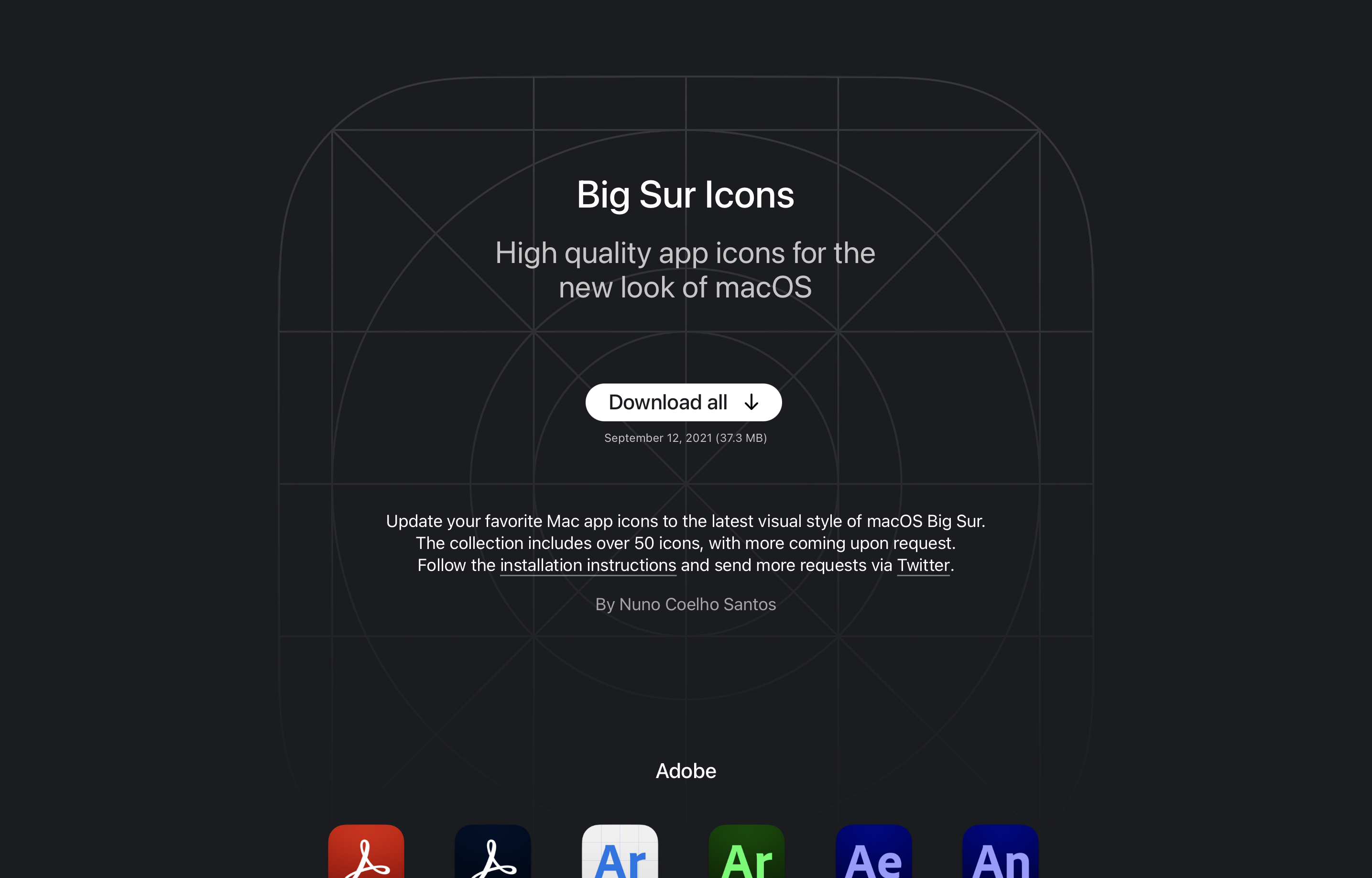 Original design of bigsuricons.com, January 2021
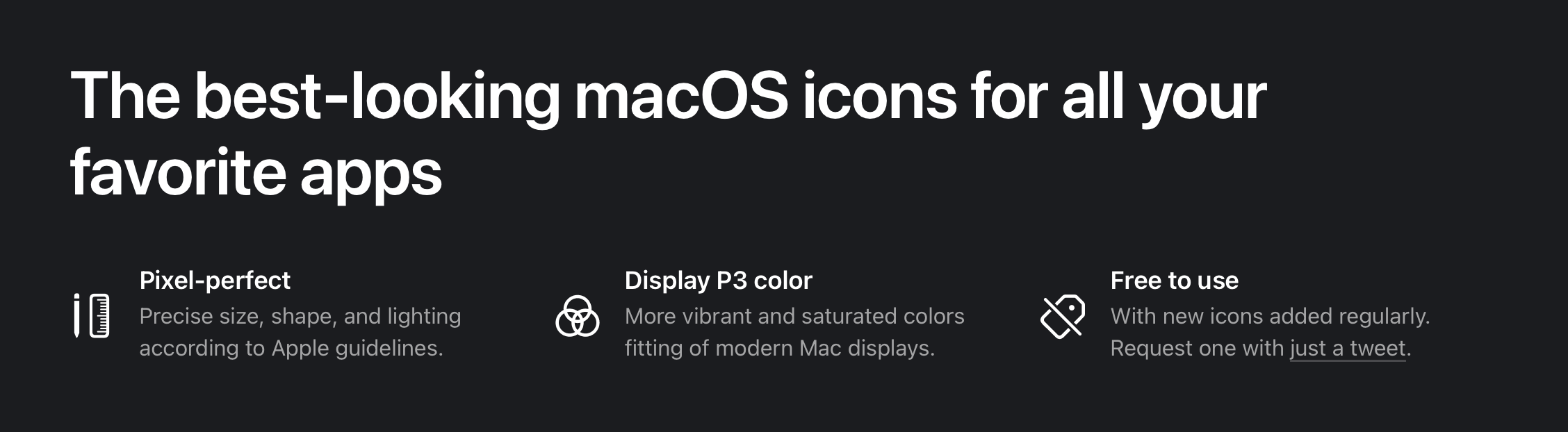
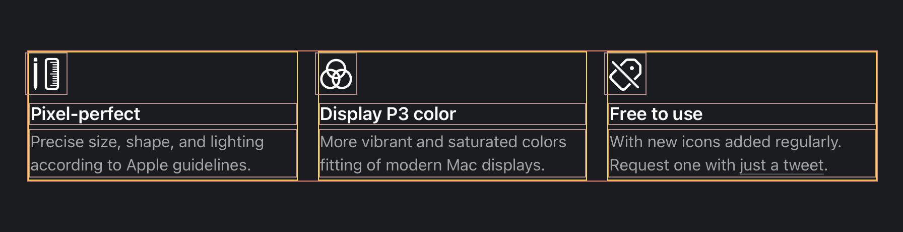
I had three key aspects I wanted to focus on:
- Larger app icons, and more spaced out. So that people can more easily see the detail in the visual design.
- State why this collection might be better than other options on the internet. Specifically calling out the craft and the use of Display P3 wide color gamut.
- Clearer download actions. It might have not been very intuitive that users can download individual icons with the previous design. And the "Download all" button perhaps didn't stand out enough.
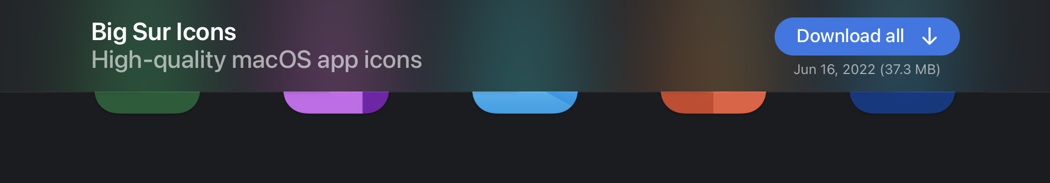
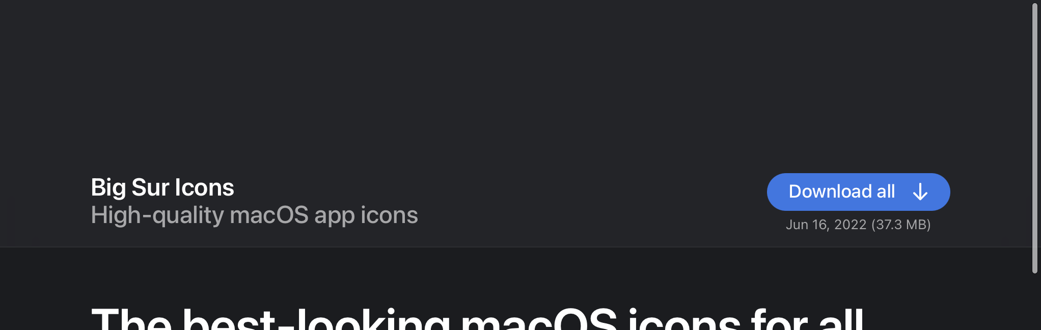
Top Section
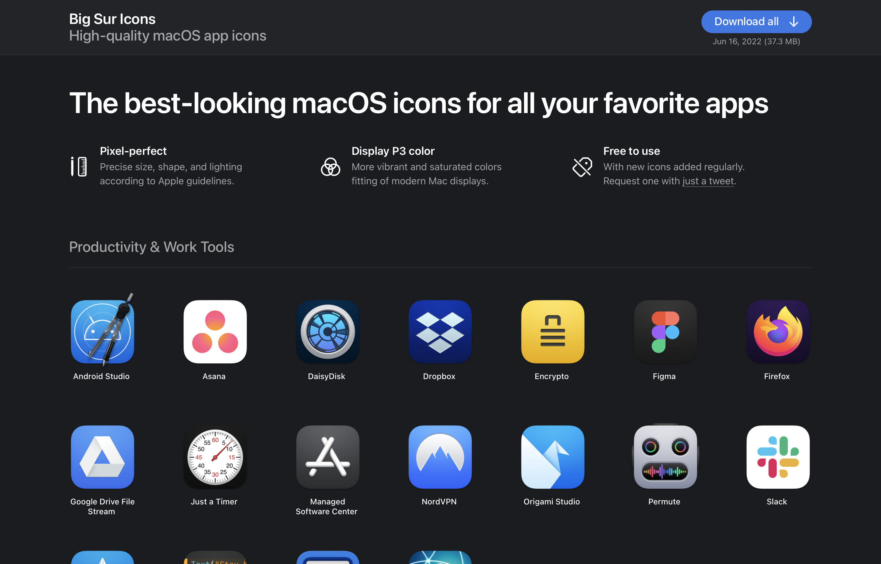
The top section is now shorter, but bolder. I removed the lengthy paragraph in favor of a more compact fixed bar at the top and 3 key selling points in a grid.
 New top section
On smaller screens, a lot of the detail is gone to make space for the icons. The download button is also reduced to just an icon.
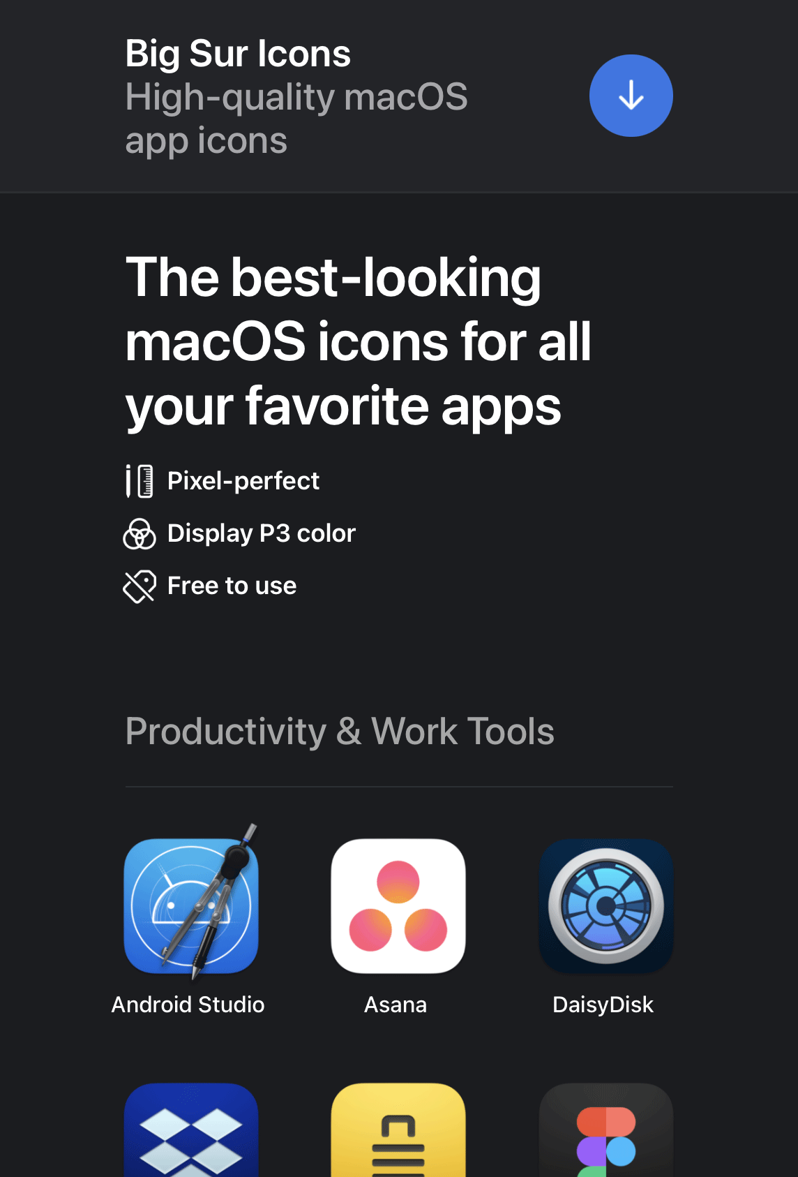 375 point width viewport
Clearer Actions
Another key aspect that I wanted to improve was the prominence of the download actions. First of all, the buttons are now blue to stand out from the dark theme. And when hovering on any icon a download button appears, covering the app name.
 New hover state
Thin Material Background
In the pursuit of adopting Apple's design language, I've decided to use a material treatment for the header. This gives the user a sense of dimensionality to the overlapping UI components. I've used the CSS backdrop-filter property to achieve this effect.
 Thin material on the header background
Code snippet for creating the thin material effect:
header {
  // Body background color with transparency.
  background-color: rgba(27, 28, 31, 0.72);

  // Increase brightness, saturation, and add blur.
  backdrop-filter: brightness(200%) saturate(150%) blur(42px);
}
Displaying Material Beyond the Scrollable Area
To keep the material appearing when the user overscolls on the top of the view, I've added an element to fake the effect of the material continuing beyond the bonds of the scrollable area. I could have also made it so that the header is constantly fixed even on overscroll, but this felt more natural.
 Extending the material beyond the scrollable area
Code snippet for adding a background to the top overscroll area:
html:after {
  // Create a fixed pseudo element that fills the width of the viewport.
  content: '';
  position: fixed;
  right: 0;
  left: 0;
  height: 300px;

  // Move the element out of view.
  // I found it necessary to have one pixel in view for the pseudo-element to render.
  top: -299px;

  // This is an eyedropped color of the thin material overlaying the body background color.
  background-color: #232428;
}
Flexbox
I don't regularly develop for the web, so I'm new to the CSS flexbox attribute. I'm pleased to say that it was incredibly easy to implement and worked very well for this purpose. I like that text is baseline aligned between columns.
 Flexbox with outlines
Code snippet for this 3-column layout:
ul {
  align-items: stretch;
  display: flex;
  flex-direction: row;
  flex-wrap: wrap;
  gap: 20px;
  list-style: none;
  li {
    flex-basis: 0;
    flex-grow: 1;
    flex-shrink: 1;
  }
}
Details & Summary
Other new standards I used were the HTML details and summary elements. I used them to collapse the installation instructions so that they only appear after the user clicks or taps on the title. This behavior works out of the box.
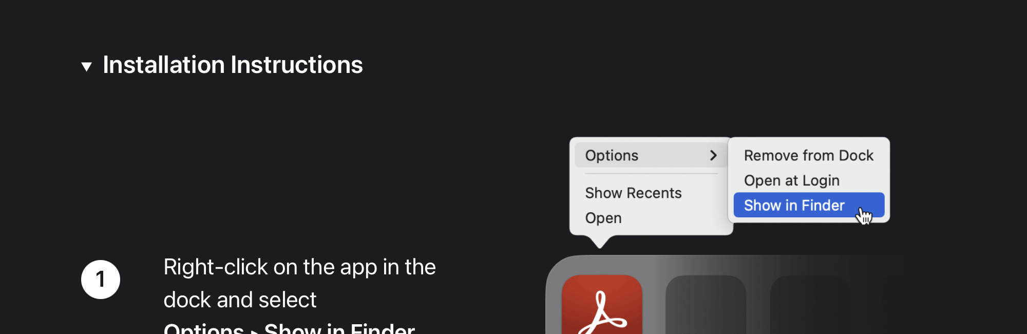 The "Installation Instructions" section uses the Details & Summary HTML elements
Code snippet for the details & summary structure.
<details>
  <summary>
    // Content always visibile goes here.
  </summary>
  // Content visible only when expanded goes here.
</details>
Tweet with context
A final detail worth adding is that I included a Twitter URL scheme that automatically pre-populates the text when creating a tweet.
Code snippet for the pre-populated tweet:
<a href="https://twitter.com/intent/tweet?text=@nunosans My Big Sur icon request:">Tweet</a>.
On the web, this would open twitter.com with the compose window prepopulated:
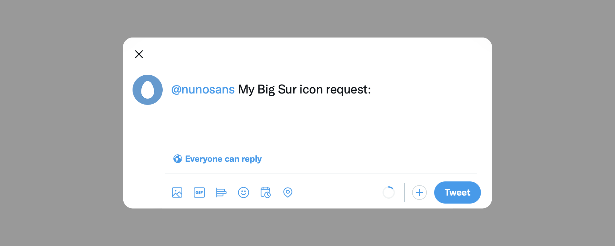 Pre-populated tweet
This is all I have to share. I hope you like this update. And if you like the project, please share it!